A technical introduction to yield loss modeling in plant pathology, from damage functions to mixed-effects and meta-analytic frameworks
English
epidemiology
yield loss
mixed models
meta-analysis
Author
Kaique Alves
Published
April 12, 2026
In plant pathology, we often spend a lot of time measuring disease. We estimate severity, count symptomatic plants, follow epidemics through time, and compare treatments, cultivars, or environments. Those measurements are essential, but they are rarely the final question. At some point, the agronomic question becomes much more direct: how much yield is being lost because of disease?
That question is simple to ask and surprisingly easy to answer poorly. A field with more disease often yields less, but the size of that loss depends on when disease occurred, how it was measured, how much disease contrast the study captured, and what the crop could have produced in the absence of disease. Two studies may show similar final severity and still imply different levels of damage if they differ in cultivar, season, management, weather, or attainable yield.
This is why yield loss modeling is useful. It gives us a way to connect disease intensity with crop performance, rather than stopping at disease intensity alone. In practical terms, this connection helps with crop-loss assessment, breeding decisions, cultivar comparisons, fungicide evaluation, and broader questions about disease risk under different environments.
The goal of this article is to build that logic step by step. I start with the basic idea of a damage function, using severity as the disease measure for clarity. Then I show how the same idea can be extended when the data come from several studies rather than from a single clean experiment. The examples later in the post use mixed-effects models and meta-analysis, but the introduction is not about the software. The main point is to understand what we are trying to estimate, why the data structure matters, and how each modeling choice changes the interpretation.
The tutorial is informed by the broader crop-loss literature in plant pathology and by my recent work on soybean rust damage under climate variability in Brazil. However, the dataset used below is simulated. I use simulated data so the workflow can be shown transparently, with known structure and with a few intentionally problematic studies that make the selection step visible. The numerical results in this post should therefore be read as teaching outputs, not as empirical evidence about soybean rust, ENSO, or any specific pathosystem. For empirical estimates and scientific conclusions, see the corresponding Plant Pathology paper and analysis page.
One practical issue will appear early in the workflow: study selection. In disease-yield analysis, not every study is equally informative for estimating damage. We need enough disease contrast, enough disease pressure, and a plausible basis for estimating yield in the absence of disease. This is not just data cleaning; it defines the evidence used to estimate the relationship between disease and yield.
Why yield loss models matter
Before writing any code, it is worth slowing down and asking what a yield loss model is supposed to do. The model is not just a convenient way to draw a line through points. It is a way to translate disease measurements into an agronomic consequence.
The biological premise is straightforward: increasing disease burden is generally associated with declining yield. However, the epidemiological interpretation depends strongly on how that relationship is parameterized, how disease was assessed, and on which quantity is treated as the inferential target.
The disease variable in a yield loss model should not be treated as an interchangeable number. Final severity, severity at a specific growth stage, AUDPC, healthy area duration, or another disease metric may each represent a different biological pathway from infection to damage. In this article I use severity as the explanatory variable for clarity, but the same modeling logic only becomes meaningful when the disease metric is aligned with the crop growth period in which yield is actually being determined.
A classical linear damage function may be written as:
\[Y = b_0 + b_1 D\]
where:
\(Y\) is yield
\(D\) is disease intensity, frequently represented by severity in percentage terms
\(b_0\) is the intercept, commonly interpreted as attainable yield
\(b_1\) is the slope, describing the change in yield per unit increase in disease
In most yield loss applications, \(b_1\) is negative. Consequently, a steeper negative slope indicates greater damage per unit increase in disease intensity.
From this formulation, we often derive the damage coefficient, a relative measure that expresses the proportional reduction in yield associated with each 1 percentage-point increase in disease:
\[DC = -100 \times \frac{b_1}{b_0}\]
This quantity is especially useful because it rescales the slope by the attainable yield. As a consequence, comparisons of disease damage become more interpretable across studies or environments that differ substantially in yield potential.
With that basic relationship in place, the next step is to separate the pieces of the model. This matters because the intercept, slope, and damage coefficient are often discussed together, but they do not answer the same biological question.
The main parameters
Before discussing model fitting, it is useful to clarify the epidemiological interpretation of the main parameters. This section is intentionally short: the goal is to give the reader a mental map before the tutorial starts using these terms repeatedly.
Attainable yield
Attainable yield is the expected yield in the absence of disease within the production context under study. In a simple linear damage function, it is approximated by the intercept \(b_0\). Biologically, it is not a universal constant; rather, it is conditional on cultivar, environment, season, management, and the entire set of factors that define the production system. Statistically, it is most credible when the study includes observations close enough to low disease levels to support that extrapolation.
Slope
The slope \(b_1\) quantifies the rate at which yield changes as disease intensity increases. If disease severity is measured in percentage points and yield in kg/ha, then the slope is interpreted as kg/ha lost per 1 percentage-point increase in severity. This interpretation is conditional on the observed disease range; slopes estimated from narrow or very low severity gradients are often unstable and should not be extrapolated to high disease pressure.
Damage coefficient
The damage coefficient is the relative expression of the slope. It addresses a more transportable epidemiological question: what fraction of attainable yield is lost for each unit increase in disease? This is particularly valuable when comparing studies conducted under distinct yield potentials, provided the attainable-yield estimate and the observed disease gradient are both credible.
A conceptual example
A convenient way to clarify the epidemiological role of these parameters is to vary them one at a time. I therefore use three separate conceptual plots rather than a single composite figure so that the contribution of each parameter remains explicit.
Code
# Load packages used throughout the tutorial.library(tidyverse)library(cowplot)library(ggthemes)library(lme4)library(lmerTest)library(metafor)library(knitr)knitr::opts_chunk$set(message =FALSE, warning =FALSE)# Use one plot theme and one random seed so the examples are reproducible.theme_set(theme_half_open(font_size =11))set.seed(42)# Shared colors for ENSO phases in all figures.enso_palette <-c("Neutral"="#1A1A1A","Warm"="#D99500","Cold"="#67B7F7")
Code
# Severity grid used by the simple conceptual examples.severity_grid <-tibble(severity =seq(0, 70, by =1))# Same slope, different intercepts: isolates attainable yield.attainable_df <-bind_rows( severity_grid %>%mutate(yield =4800-22* severity,scenario ="Higher attainable yield"), severity_grid %>%mutate(yield =3900-22* severity,scenario ="Lower attainable yield"))# Same intercept, different slopes: isolates damage rate.slope_df <-bind_rows( severity_grid %>%mutate(yield =4300-14* severity,scenario ="Lower damage slope"), severity_grid %>%mutate(yield =4300-30* severity,scenario ="Higher damage slope"))# Different intercepts and slopes: closer to empirical heterogeneity.combined_df <-bind_rows( severity_grid %>%mutate(yield =4700-14* severity,scenario ="High yield, low damage"), severity_grid %>%mutate(yield =3900-30* severity,scenario ="Low yield, high damage"))
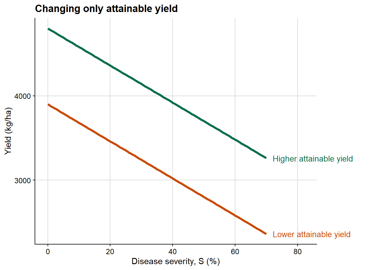
1. Changing only attainable yield
The first plot isolates the effect of attainable yield while holding the slope constant.
In this first case, both lines share the same slope, meaning that disease causes the same absolute yield reduction per unit increase in severity in both scenarios. The only difference lies in the intercept. Epidemiologically, this implies a difference in baseline productivity rather than a difference in the damage process itself.
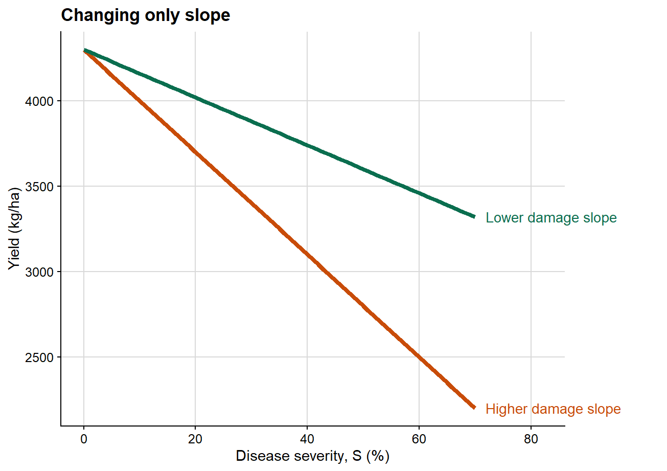
2. Changing only slope
The next plot isolates the effect of the damage slope while holding attainable yield constant.
Here the intercept is identical in both scenarios, so attainable yield is unchanged. What differs is the rate at which yield declines as severity increases. This is the clearest graphical representation of the epidemiological meaning of the damage slope.
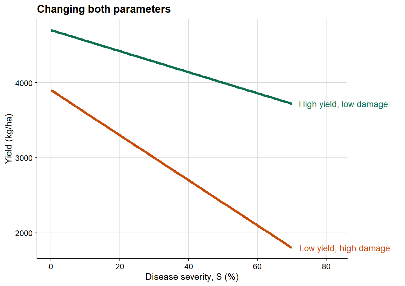
3. Changing attainable yield and slope together
This third plot combines both dimensions simultaneously, which is generally closer to the structure of empirical datasets.
This final case is usually the most realistic one in plant pathology. Empirical datasets commonly differ simultaneously in attainable yield and in damage slope. That is precisely why the damage coefficient is so useful: it rescales the slope by attainable yield and therefore improves interpretability across heterogeneous production contexts.
The conceptual example keeps the biology simple on purpose. Real yield loss datasets are rarely this clean. They usually combine several studies, years, disease gradients, and environmental contexts. The next section creates a simulated dataset with that kind of structure so that the modeling workflow has something realistic to work with.
Simulating a multi-study dataset
To demonstrate the models, I first simulate a candidate dataset that resembles a realistic plant pathology structure: multiple studies nested within years and conducted under different ENSO phases. Each study is allowed to have its own attainable yield and its own severity-yield slope. The point is not to mimic one particular experiment perfectly, but to create a dataset that contains the problems analysts commonly face in practice.
In practice, not every candidate study is equally informative for estimating yield loss. A study with almost no disease gradient, very low maximum severity, or an implausible estimated attainable yield may contribute more noise than information to the damage function. The simulation below therefore creates both informative studies and a small set of intentionally problematic studies, so that the selection step can be demonstrated before any mixed model or meta-analysis is fitted.
Code
# One row per candidate study. The last six studies are deliberately# constructed to fail one of the screening criteria later in the workflow.study_info <-tibble(study =factor(1:24),year =factor(rep(2013:2020, each =3)),enso =factor(rep(c("Neutral", "Cold", "Warm"), times =8),levels =c("Neutral", "Cold", "Warm")),screening_scenario =case_when(as.integer(study) %in%c(19, 20) ~"Limited severity range",as.integer(study) %in%c(21, 22) ~"Low maximum severity",as.integer(study) ==23~"High intercept outlier",as.integer(study) ==24~"Low intercept outlier",TRUE~"Retained candidate" )) %>%mutate(# ENSO phases are allowed to differ in attainable yield.attainable =case_when( enso =="Warm"~rnorm(n(), mean =4350, sd =180), enso =="Neutral"~rnorm(n(), mean =4200, sd =180), enso =="Cold"~rnorm(n(), mean =4050, sd =180) ),# Two studies receive unrealistic attainable-yield values so the# intercept-outlier criterion can be demonstrated.attainable =case_when( screening_scenario =="High intercept outlier"~ attainable +1600, screening_scenario =="Low intercept outlier"~ attainable -1400,TRUE~ attainable ),# ENSO phases are also allowed to differ in disease damage slope.slope =case_when( enso =="Warm"~rnorm(n(), mean =-30, sd =3.5), enso =="Neutral"~rnorm(n(), mean =-22, sd =3.0), enso =="Cold"~rnorm(n(), mean =-17, sd =2.5) ) )candidate_damage_df <- study_info %>%mutate(data = purrr::pmap(list(attainable, slope, screening_scenario), \(b0, b1, scenario) {# Problematic studies receive either a narrow severity range or# very low maximum severity; the others span a wider disease gradient. severity <-if (scenario =="Limited severity range") {sort(runif(14, min =22, max =26)) } elseif (scenario =="Low maximum severity") {seq(0, 9.5, length.out =14) } else {sort(runif(14, min =0, max =70)) }# Yield follows a linear damage function plus observation-level noise.tibble(severity = severity,yield = b0 + b1 * severity +rnorm(14, mean =0, sd =130) ) } )) %>% tidyr::unnest(data) %>%mutate(# Keep simulated values inside plausible plotting bounds.severity =pmax(severity, 0),yield =pmax(yield, 600) )# Display only a few rows so the reader can inspect the generated structure.candidate_damage_df %>% dplyr::select(study, year, enso, screening_scenario, severity, yield) %>%slice_head(n =8) %>%kable(digits =2, caption ="First rows of the simulated candidate multi-study dataset")
First rows of the simulated candidate multi-study dataset
study
year
enso
screening_scenario
severity
yield
1
2013
Neutral
Retained candidate
2.08
4286.70
1
2013
Neutral
Retained candidate
2.28
4635.06
1
2013
Neutral
Retained candidate
6.28
4345.97
1
2013
Neutral
Retained candidate
10.18
4221.84
1
2013
Neutral
Retained candidate
22.07
3819.73
1
2013
Neutral
Retained candidate
23.27
3949.15
1
2013
Neutral
Retained candidate
23.76
3833.61
1
2013
Neutral
Retained candidate
27.05
3784.80
Selecting studies for damage analysis
Once the candidate dataset exists, the next decision is not which model to fit. The next decision is whether the studies actually contain enough information to support a damage analysis.
At this stage, the workflow shifts from simulating candidate studies to deciding which studies are eligible for damage analysis. The screening is done at the study level, not at the observation level, because the inferential unit being accepted or rejected is the study-specific disease-yield relationship.
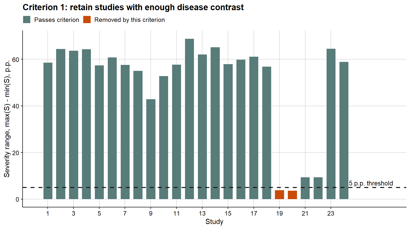
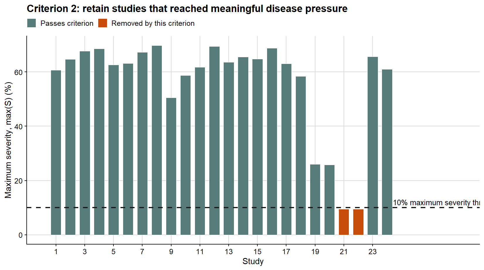
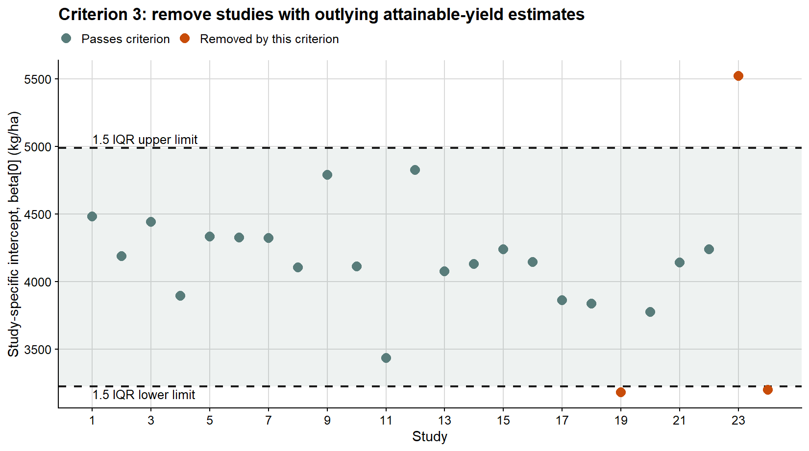
Here I use three transparent criteria. First, the within-study severity range must be greater than 5 percentage points. Second, the maximum severity observed within the study must be greater than 10%. Third, the intercept from the study-specific linear regression must not be an outlier according to the 1.5 IQR rule.
These criteria are not meant to prove that the selected studies are perfect. They are practical safeguards against estimating damage from studies with insufficient disease contrast, very low disease pressure, or implausible attainable-yield estimates. In an empirical analysis, the numerical thresholds should be justified before the final model is interpreted and, when possible, checked with sensitivity analyses. I keep this step explicit because reproducing a yield loss analysis requires reproducing both the model specification and the rules used to decide which studies are informative enough to enter the analysis.
# Fit a simple study-specific regression only for screening purposes.# These fits help diagnose whether each study has a usable disease-yield signal.study_screening <- candidate_damage_df %>%nest(data =-c(study, year, enso, screening_scenario)) %>%mutate(# Criterion 1 and 2: disease contrast and disease pressure.severity_min = purrr::map_dbl(data, ~min(.x$severity)),severity_max = purrr::map_dbl(data, ~max(.x$severity)),severity_range = severity_max - severity_min,# Criterion 3: attainable-yield plausibility via the intercept.fit_yield = purrr::map(data, ~lm(yield ~ severity, data = .x)),intercept = purrr::map_dbl(fit_yield, ~unname(coef(.x)[1])),slope_yield = purrr::map_dbl(fit_yield, ~unname(coef(.x)[2])))# Intercept outliers are detected across the candidate set using the 1.5 IQR rule.intercept_limits <- study_screening %>%summarise(q1 =quantile(intercept, 0.25),q3 =quantile(intercept, 0.75),iqr =IQR(intercept),lower = q1 -1.5* iqr,upper = q3 +1.5* iqr )study_screening <- study_screening %>%mutate(# Apply the three criteria and keep a human-readable reason for exclusion.enough_gradient = severity_range >5,enough_maximum_severity = severity_max >10,intercept_outlier = intercept < intercept_limits$lower | intercept > intercept_limits$upper,selected = enough_gradient & enough_maximum_severity &!intercept_outlier,screening_result =case_when(!enough_gradient ~"Removed: severity range <= 5 p.p.",!enough_maximum_severity ~"Removed: maximum severity <= 10%", intercept_outlier ~"Removed: intercept outlier",TRUE~"Selected" ))# Report the screening table before filtering the dataset.study_screening %>% dplyr::select( study, year, enso, screening_scenario, severity_range, severity_max, intercept, screening_result ) %>%mutate(across(c(severity_range, severity_max, intercept), ~round(.x, 2)) ) %>%kable(caption ="Study-level screening of the simulated candidate dataset")
Study-level screening of the simulated candidate dataset
study
year
enso
screening_scenario
severity_range
severity_max
intercept
screening_result
1
2013
Neutral
Retained candidate
58.63
60.71
4482.26
Selected
2
2013
Cold
Retained candidate
64.51
64.68
4189.33
Selected
3
2013
Warm
Retained candidate
63.78
67.65
4440.60
Selected
4
2014
Neutral
Retained candidate
64.34
68.54
3893.56
Selected
5
2014
Cold
Retained candidate
57.51
62.61
4333.12
Selected
6
2014
Warm
Retained candidate
60.90
63.20
4325.53
Selected
7
2015
Neutral
Retained candidate
57.67
67.29
4323.19
Selected
8
2015
Cold
Retained candidate
55.14
69.72
4104.14
Selected
9
2015
Warm
Retained candidate
42.93
50.49
4787.89
Selected
10
2016
Neutral
Retained candidate
52.91
58.70
4110.56
Selected
11
2016
Cold
Retained candidate
57.75
61.77
3434.11
Selected
12
2016
Warm
Retained candidate
68.83
69.46
4825.50
Selected
13
2017
Neutral
Retained candidate
62.15
63.63
4077.57
Selected
14
2017
Cold
Retained candidate
65.26
65.51
4131.78
Selected
15
2017
Warm
Retained candidate
57.94
64.77
4239.40
Selected
16
2018
Neutral
Retained candidate
59.96
68.74
4145.85
Selected
17
2018
Cold
Retained candidate
61.17
63.07
3862.12
Selected
18
2018
Warm
Retained candidate
56.90
58.46
3837.21
Selected
19
2019
Neutral
Limited severity range
3.95
26.00
3181.89
Removed: severity range <= 5 p.p.
20
2019
Cold
Limited severity range
3.65
25.78
3773.90
Removed: severity range <= 5 p.p.
21
2019
Warm
Low maximum severity
9.50
9.50
4139.89
Removed: maximum severity <= 10%
22
2020
Neutral
Low maximum severity
9.50
9.50
4240.69
Removed: maximum severity <= 10%
23
2020
Cold
High intercept outlier
64.60
65.65
5520.25
Removed: intercept outlier
24
2020
Warm
Low intercept outlier
58.99
60.96
3200.17
Removed: intercept outlier
The three plots below show the same screening logic criterion by criterion. In each case, the dashed line or shaded band represents the threshold used to decide whether the study remains eligible for the damage analysis.
# Create plotting labels once, then reuse them across the three screening plots.study_screening_plot <- study_screening %>%mutate(study_number =as.integer(study),severity_range_status =if_else( enough_gradient,"Passes criterion","Removed by this criterion" ),maximum_severity_status =if_else( enough_maximum_severity,"Passes criterion","Removed by this criterion" ),intercept_status =if_else( intercept_outlier,"Removed by this criterion","Passes criterion" ) )# Use the same palette for all criterion-specific plots.criterion_palette <-c("Passes criterion"="#587C7A","Removed by this criterion"="#C84C09")ggplot( study_screening_plot,aes(study_number, severity_range, fill = severity_range_status)) +geom_col(width =0.72, color ="white", linewidth =0.25) +geom_hline(yintercept =5, linetype =2, color ="#1A1A1A", linewidth =0.8) +annotate("text",x =24.4,y =5,label ="5 p.p. threshold",hjust =0,vjust =-0.45,size =3.4 ) +scale_fill_manual(values = criterion_palette) +scale_x_continuous(breaks =seq(1, 24, by =2), limits =c(0.4, 27.5)) +background_grid() +labs(title ="Criterion 1: retain studies with enough disease contrast",x ="Study",y ="Severity range, max(S) - min(S), p.p.",fill =NULL ) +theme(legend.position ="top")
The first criterion removes studies with too little contrast in disease severity. Without a minimum severity range, the estimated damage slope is weakly identified because the study contains little information about how yield changes across disease intensities.
The second criterion removes studies in which the epidemic remained too weak to support a damage estimate. A study may have some variation in severity but still never reach disease levels high enough to represent a meaningful yield-loss gradient.
The third criterion evaluates the first-regression intercept because that value will later be interpreted as attainable yield and used to compute relative yield loss. An outlying intercept does not automatically mean that a study is biologically impossible, but it is a warning that the fitted disease-free yield estimate may dominate the damage coefficient. In applied work, this kind of flag should lead to inspection of the original study, its yield scale, its disease range, and any design or measurement issues.
# Keep only studies that passed all screening criteria.damage_df <- candidate_damage_df %>%semi_join( study_screening %>%filter(selected) %>% dplyr::select(study, year, enso),by =c("study", "year", "enso") ) %>%mutate(# Drop unused factor levels so later model summaries and plots are cleaner.study =droplevels(study),year =droplevels(year),enso =factor(enso, levels =c("Neutral", "Cold", "Warm")) )
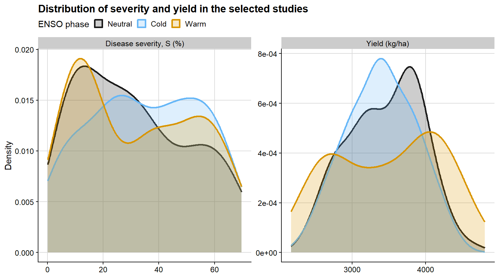
After screening, it is useful to inspect the selected observations before moving to model fitting. The first diagnostic view compares the marginal distributions of disease severity and yield by ENSO phase. This is not a formal model diagnostic, but it helps verify whether the selected dataset still spans a useful disease gradient and whether the yield distribution differs across the simulated environmental contexts.
# Put severity and yield into long format so they can be shown in one faceted plot.selected_distribution_df <- damage_df %>%transmute( study,enso =factor(enso, levels =c("Neutral", "Cold", "Warm")),severity = severity,yield = yield ) %>%pivot_longer(cols =c(severity, yield),names_to ="variable",values_to ="value" ) %>%mutate(variable =recode( variable,severity ="Disease severity, S (%)",yield ="Yield (kg/ha)" ) )ggplot(selected_distribution_df, aes(value, color = enso, fill = enso)) +geom_density(alpha =0.22, linewidth =0.9) +facet_wrap(~variable, scales ="free", nrow =1) +scale_color_manual(values = enso_palette) +scale_fill_manual(values = enso_palette) +background_grid() +labs(title ="Distribution of severity and yield in the selected studies",x =NULL,y ="Density",color ="ENSO phase",fill ="ENSO phase" ) +theme(legend.position ="top")
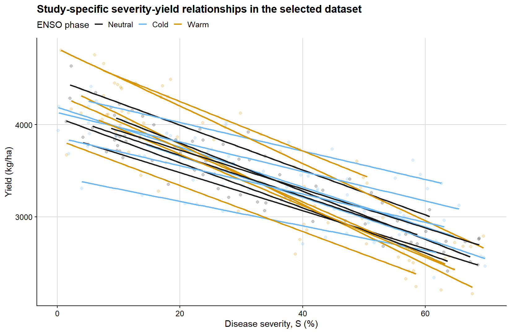
The second diagnostic view keeps the response and explanatory variable together. Each line is a study-specific linear fit to the selected observations, with line color indicating the ENSO phase. This view is deliberately shown in a single panel so that between-study heterogeneity in baseline yield and damage slope remains visible before the mixed-effects model is introduced.
# Each line is an exploratory within-study fit, not the final model.ggplot( damage_df,aes(x = severity,y = yield,group = study,color =factor(enso, levels =c("Neutral", "Cold", "Warm")) )) +geom_point(alpha =0.22, size =1.5, show.legend =FALSE) +geom_smooth(method ="lm", formula = y ~ x, se =FALSE, linewidth =0.8) +scale_color_manual(values = enso_palette) +background_grid() +labs(title ="Study-specific severity-yield relationships in the selected dataset",x ="Disease severity, S (%)",y ="Yield (kg/ha)",color ="ENSO phase" ) +theme(legend.position ="top")
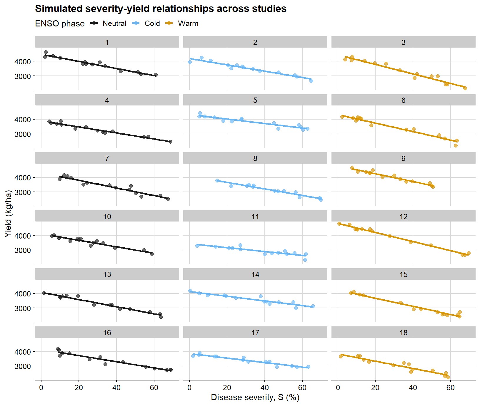
The next figure displays the selected simulated dataset on a study-by-study basis. Its main purpose is to make clear why a mixed-effects framework becomes attractive under this type of hierarchical structure.
# Faceting by study makes the hierarchical data structure visible.ggplot(damage_df, aes(severity, yield, color = enso)) +geom_point(alpha =0.65, size =2) +geom_smooth(method ="lm", se =FALSE, linewidth =1) +facet_wrap(~study, ncol =3) +scale_color_manual(values = enso_palette) +background_grid() +labs(title ="Simulated severity-yield relationships across studies",x ="Disease severity, S (%)",y ="Yield (kg/ha)",color ="ENSO phase" ) +theme(legend.position ="top")
This is the type of structure in which ordinary regression becomes limited. Each selected study has its own baseline productivity and damage slope, while the full dataset also includes between-year and between-phase sources of variation.
Because this is a didactic simulation, the ENSO-specific differences in attainable yield and slope are intentionally cleaner than what is typically observed in empirical datasets. Field data often exhibit substantially greater overlap among groups, weaker moderator signals, noisier study-specific relationships, and additional reasons to examine whether each study is representative enough for a damage analysis.
After this screening step, the analysis has a clearer target: a selected set of studies with enough disease contrast and plausible yield baselines. That is the point at which a mixed-effects model becomes useful, because the selected data still have a hierarchical structure that should not be ignored.
Modeling yield loss with mixed-effects models
Mixed models are useful when observations are not independent because they are clustered within studies, years, locations, or other grouping factors. In yield loss datasets, this is usually the rule rather than the exception. The key benefit is that the model can estimate an average damage function while allowing individual studies to depart from that average in both attainable yield and damage slope. In other words, the model gives us a common summary without pretending that every study behaved identically.
1. A general damage coefficient without moderators
The first step is deliberately simple: fit a mixed model with severity as the only fixed-effect predictor. This yields a population-average attainable yield and a population-average slope while still accounting for study-to-study heterogeneity through random effects. The random slope term is important here because it acknowledges that disease damage is not expected to be identical across all field studies.
# Fit the overall mixed model directly to the selected observation-level data.damage_lmer_overall <-lmer( yield ~ severity + (1+ severity | study) + (1| year),data = damage_df,REML =TRUE,control =lmerControl(optimizer ="bobyqa",optCtrl =list(maxfun =2e5) ))# Inspect fixed effects, random effects, and model fit information.summary(damage_lmer_overall)
Linear mixed model fit by REML. t-tests use Satterthwaite's method [
lmerModLmerTest]
Formula: yield ~ severity + (1 + severity | study) + (1 | year)
   Data: damage_df
Control: lmerControl(optimizer = "bobyqa", optCtrl = list(maxfun = 2e+05))

REML criterion at convergence: 3266.3

Scaled residuals:
     Min       1Q   Median       3Q      Max
-2.47399 -0.58857  0.02183  0.61328  2.52533

Random effects:
 Groups   Name        Variance  Std.Dev. Corr
 study    (Intercept) 106673.34 326.6
          severity        28.09   5.3    -0.66
 year     (Intercept)      0.00   0.0
 Residual              16934.04 130.1
Number of obs: 252, groups:  study, 18; year, 6

Fixed effects:
            Estimate Std. Error       df t value Pr(>|t|)
(Intercept) 4198.537     78.693   16.932   53.35  < 2e-16 ***
severity     -23.137      1.321   17.272  -17.52 1.95e-12 ***
---
Signif. codes:  0 '***' 0.001 '**' 0.01 '*' 0.05 '.' 0.1 ' ' 1

Correlation of Fixed Effects:
         (Intr)
severity -0.666
optimizer (bobyqa) convergence code: 0 (OK)
boundary (singular) fit: see help('isSingular')
For the mixed-model summaries below, I use a parametric bootstrap. This is particularly useful for the damage coefficient because the latter is a nonlinear function of the intercept and slope:
\[DC = -100 \times \frac{b_1}{b_0}\]
The example uses 250 bootstrap simulations to keep the article render reasonably fast. For a final empirical analysis, I would usually increase this number and report convergence, singular-fit checks, residual diagnostics, and any sensitivity of the damage coefficient to model structure.
# Helper for percentile bootstrap intervals from bootMer output.boot_percentile <-function(boot_obj, terms, level =0.95) { alpha <- (1- level) /2 lower <-apply(boot_obj$t[, terms, drop =FALSE], 2, quantile, probs = alpha, na.rm =TRUE) upper <-apply(boot_obj$t[, terms, drop =FALSE], 2, quantile, probs =1- alpha, na.rm =TRUE)tibble(term = terms,estimate = boot_obj$t0[terms],ci_lb = lower,ci_ub = upper )}# Prediction grid used to draw the population-average damage function.overall_grid <-tibble(severity =seq(0, 70, by =1))overall_boot_fun <-function(fit) {# fixed effects define the population-average damage function beta <-fixef(fit) b0 <-unname(beta["(Intercept)"]) b1 <-unname(beta["severity"])# population-average fitted values for the confidence band mu <-predict(fit, newdata = overall_grid, re.form =NA)# new observations include residual variation for prediction intervals y_new <-rnorm(length(mu), mean = mu, sd =sigma(fit))# Return scalar summaries and fitted/predicted curves in one vector.c(attainable_yield = b0,slope = b1,damage_coefficient =-100* b1 / b0, stats::setNames(mu, paste0("fit_", seq_along(mu))), stats::setNames(y_new, paste0("pred_", seq_along(y_new))) )}# Parametric bootstrap refits the model repeatedly to quantify uncertainty.overall_boot <-bootMer( damage_lmer_overall,FUN = overall_boot_fun,nsim =250,type ="parametric",use.u =FALSE,seed =123)# Extract intervals for the three main epidemiological summaries.overall_damage <-boot_percentile( overall_boot,terms =c("attainable_yield", "slope", "damage_coefficient")) %>%mutate(term =recode( term,attainable_yield ="Attainable yield",slope ="Slope",damage_coefficient ="Damage coefficient" ),across(c(estimate, ci_lb, ci_ub), ~round(.x, 2)) )overall_damage %>%kable(caption ="Bootstrap percentile intervals for the overall mixed-model summary")
Bootstrap percentile intervals for the overall mixed-model summary
term
estimate
ci_lb
ci_ub
Attainable yield
4198.54
4030.14
4350.77
Slope
-23.14
-25.64
-20.50
Damage coefficient
0.55
0.50
0.60
Under this formulation:
attainable yield is the model-based population-average yield at zero disease
slope is the model-based population-average absolute yield loss per 1 percentage-point increase in severity
damage coefficient is the corresponding relative yield loss per 1 percentage-point increase in severity
the bootstrap confidence intervals summarize the uncertainty around those population-level quantities
This summary is useful, but it should not be interpreted as a universal or context-free damage coefficient. It remains a population-level estimate conditional on the adopted mixed-model structure and on the coding of the data.
Confidence intervals versus prediction intervals
These two interval types answer different inferential questions:
a confidence interval around the fitted line quantifies uncertainty in the estimated mean response
a prediction interval is wider because it characterizes where a new observation may fall around the model-implied mean
So, in practice:
confidence intervals are about the uncertainty of the model-implied average relationship
prediction intervals are about the uncertainty of future data points around that relationship
In the code below, the prediction interval includes residual variation around the population-average curve. It should therefore be read as an observation-level interval around the fixed-effect mean, not as a full new-study predictive interval. Predicting an entirely new study or year would require adding the relevant random-effect variation as well.
# Convert bootstrap draws into confidence and prediction bands.overall_fit <-predict(damage_lmer_overall, newdata = overall_grid, re.form =NA)fit_cols_overall <-grep("^fit_", colnames(overall_boot$t), value =TRUE)pred_cols_overall <-grep("^pred_", colnames(overall_boot$t), value =TRUE)overall_curve <- overall_grid %>%mutate(fit = overall_fit,conf_lb =apply(overall_boot$t[, fit_cols_overall, drop =FALSE], 2, quantile, probs =0.025),conf_ub =apply(overall_boot$t[, fit_cols_overall, drop =FALSE], 2, quantile, probs =0.975),pred_lb =apply(overall_boot$t[, pred_cols_overall, drop =FALSE], 2, quantile, probs =0.025),pred_ub =apply(overall_boot$t[, pred_cols_overall, drop =FALSE], 2, quantile, probs =0.975) )
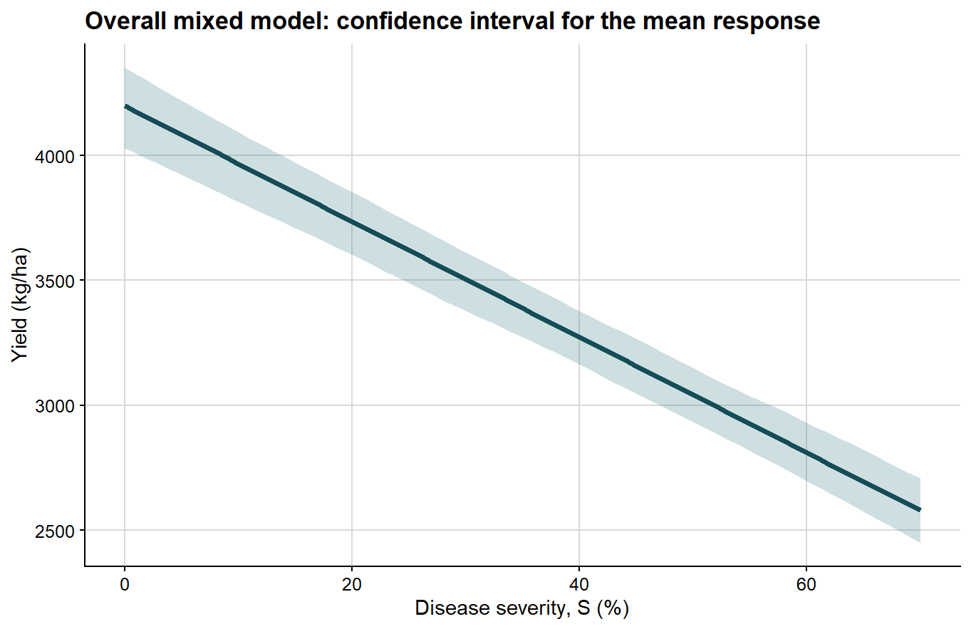
The confidence interval is shown first because it is the narrower quantity and directly reflects uncertainty around the estimated mean response.
ggplot(overall_curve, aes(severity, fit)) +# confidence interval for the mean fitted responsegeom_ribbon(aes(ymin = conf_lb, ymax = conf_ub), fill ="#1f6f78", alpha =0.22) +geom_line(color ="#154d57", linewidth =1.4) +background_grid() +labs(title ="Overall mixed model: confidence interval for the mean response",x ="Disease severity, S (%)",y ="Yield (kg/ha)" )
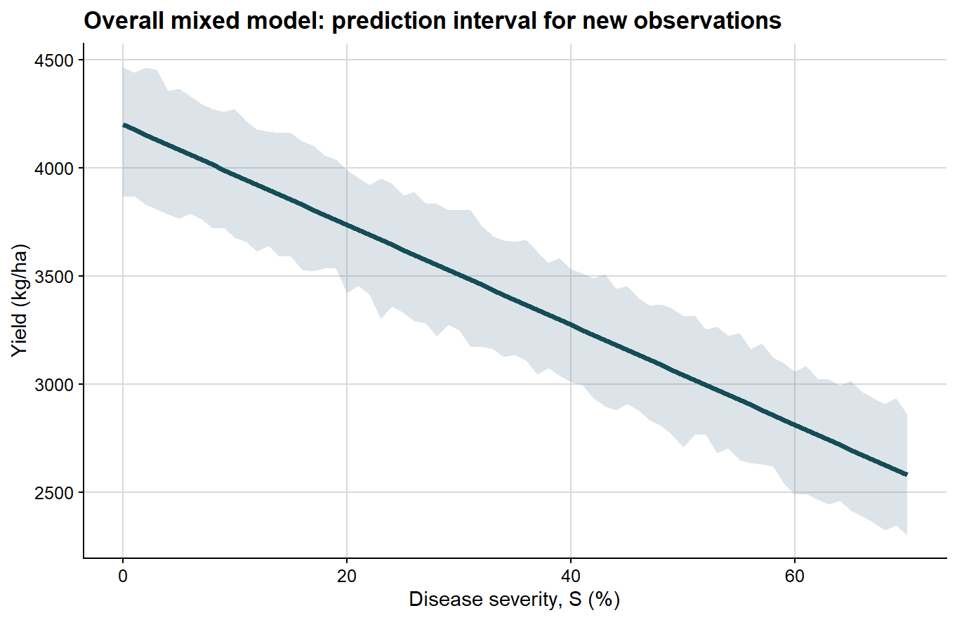
Next comes the prediction interval, which is wider because it includes the dispersion of future observations around the mean response.
Because these bands are obtained from percentile limits of a finite parametric bootstrap sample, they are not expected to look perfectly smooth or exactly linear, especially when the number of bootstrap refits is modest. Small local irregularities in the ribbon therefore reflect Monte Carlo error in the bootstrap quantiles rather than a biological departure from linearity in the fitted damage function.
ggplot(overall_curve, aes(severity, fit)) +# prediction interval for a new observationgeom_ribbon(aes(ymin = pred_lb, ymax = pred_ub), fill ="#6e8fa4", alpha =0.24) +geom_line(color ="#154d57", linewidth =1.4) +background_grid() +labs(title ="Overall mixed model: prediction interval for new observations",x ="Disease severity, S (%)",y ="Yield (kg/ha)" )
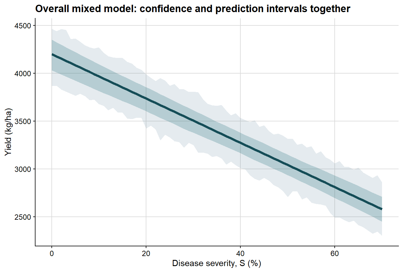
Once that distinction is clear, both intervals can be displayed together in a single plot.
ggplot(overall_curve, aes(severity, fit)) +# prediction interval is wider and shown firstgeom_ribbon(aes(ymin = pred_lb, ymax = pred_ub), fill ="#6e8fa4", alpha =0.18) +# confidence interval is narrower and shown on topgeom_ribbon(aes(ymin = conf_lb, ymax = conf_ub), fill ="#1f6f78", alpha =0.24) +geom_line(color ="#154d57", linewidth =1.5) +background_grid() +labs(title ="Overall mixed model: confidence and prediction intervals together",x ="Disease severity, S (%)",y ="Yield (kg/ha)" )
2. Extending the mixed-effects model with moderators
Once the general relationship has been established, the next question is whether the damage function changes across epidemiological contexts. Here I use ENSO phase as a moderator. In this simulated example, ENSO phase represents a broad environmental context; in an empirical study, it should be interpreted cautiously as a contextual classifier rather than as a direct mechanistic cause unless the design and supporting covariates justify that claim.
The model now includes:
a fixed effect of severity
a fixed effect of ENSO phase
a severity by ENSO interaction
a random intercept and random slope for each study
a random intercept for year
# Fit the moderated model: ENSO changes the intercept and the severity slope.damage_lmer_enso <-lmer( yield ~ severity * enso + (1+ severity | study) + (1| year),data = damage_df,REML =TRUE,control =lmerControl(optimizer ="bobyqa",optCtrl =list(maxfun =2e5) ))# Inspect the interaction terms before translating them into phase-specific summaries.summary(damage_lmer_enso)
Linear mixed model fit by REML. t-tests use Satterthwaite's method [
lmerModLmerTest]
Formula: yield ~ severity * enso + (1 + severity | study) + (1 | year)
   Data: damage_df
Control: lmerControl(optimizer = "bobyqa", optCtrl = list(maxfun = 2e+05))

REML criterion at convergence: 3213

Scaled residuals:
     Min       1Q   Median       3Q      Max
-2.36119 -0.60807  0.03054  0.64302  2.43939

Random effects:
 Groups   Name        Variance  Std.Dev. Corr
 study    (Intercept) 88757.722 297.922
          severity        5.274   2.297  -0.55
 year     (Intercept)     0.000   0.000
 Residual             16973.294 130.282
Number of obs: 252, groups:  study, 18; year, 6

Fixed effects:
                  Estimate Std. Error       df t value Pr(>|t|)
(Intercept)       4170.151    124.553   14.816  33.481 2.24e-15 ***
severity           -23.135      1.195   14.452 -19.363 9.67e-12 ***
ensoCold          -166.891    176.693   14.997  -0.945  0.35987
ensoWarm           246.456    176.187   14.829   1.399  0.18243
severity:ensoCold    5.846      1.693   14.640   3.453  0.00366 **
severity:ensoWarm   -5.877      1.679   14.006  -3.500  0.00354 **
---
Signif. codes:  0 '***' 0.001 '**' 0.01 '*' 0.05 '.' 0.1 ' ' 1

Correlation of Fixed Effects:
            (Intr) sevrty ensCld ensWrm svrt:C
severity    -0.534
ensoCold    -0.705  0.377
ensoWarm    -0.707  0.378  0.498
svrty:nsCld  0.377 -0.706 -0.542 -0.267
svrty:nsWrm  0.380 -0.711 -0.268 -0.536  0.502
optimizer (bobyqa) convergence code: 0 (OK)
boundary (singular) fit: see help('isSingular')
The fixed part of the model now addresses a moderated question: on average, does the severity-yield relationship differ among ENSO phases?
The random part answers a different question: how much do individual studies deviate from the population-average intercept and slope?
Interpreting the moderated mixed model
Under this formulation:
the intercept corresponds to the expected attainable yield for the reference ENSO class when severity is zero
the severity coefficient is the baseline damage slope for the reference class
the interaction terms quantify how the slope changes in the other ENSO phases
the study-level random effects allow each study to have its own attainable yield and its own damage slope
This is often a strong modeling strategy when the primary objective is to analyze the full hierarchical dataset directly while testing whether a contextual factor modifies disease damage.
The same bootstrap strategy can be extended here, now allowing the phase-specific summaries to vary across bootstrap refits.
# Build a grid with all severity values for each ENSO phase.enso_grid <-expand_grid(severity =seq(0, 70, by =1),enso =factor(c("Neutral", "Cold", "Warm"), levels =c("Neutral", "Cold", "Warm")))enso_boot_fun <-function(fit) {# Extract phase-specific intercepts and slopes from the fixed effects.# Neutral is the reference phase; Cold and Warm add their coefficients. beta <-fixef(fit) b0_neutral <-unname(beta["(Intercept)"]) b1_neutral <-unname(beta["severity"]) b0_cold <-unname(beta["(Intercept)"] + beta["ensoCold"]) b1_cold <-unname(beta["severity"] + beta["severity:ensoCold"]) b0_warm <-unname(beta["(Intercept)"] + beta["ensoWarm"]) b1_warm <-unname(beta["severity"] + beta["severity:ensoWarm"])# Population-average fitted values and new observation draws. mu <-predict(fit, newdata = enso_grid, re.form =NA) y_new <-rnorm(length(mu), mean = mu, sd =sigma(fit))# Match each grid row to its phase-specific attainable yield. attainable_vec <-case_when( enso_grid$enso =="Neutral"~ b0_neutral, enso_grid$enso =="Cold"~ b0_cold,TRUE~ b0_warm )# Convert absolute yield predictions to relative yield loss. rel_loss_mu <-100* (attainable_vec - mu) / attainable_vec rel_loss_pred <-100* (attainable_vec - y_new) / attainable_vec# Return phase-specific summaries plus curves for plotting.c(neutral_attainable_yield = b0_neutral,neutral_slope = b1_neutral,neutral_damage_coefficient =-100* b1_neutral / b0_neutral,cold_attainable_yield = b0_cold,cold_slope = b1_cold,cold_damage_coefficient =-100* b1_cold / b0_cold,warm_attainable_yield = b0_warm,warm_slope = b1_warm,warm_damage_coefficient =-100* b1_warm / b0_warm, stats::setNames(mu, paste0("fit_", seq_along(mu))), stats::setNames(y_new, paste0("pred_", seq_along(y_new))), stats::setNames(rel_loss_mu, paste0("loss_fit_", seq_along(rel_loss_mu))), stats::setNames(rel_loss_pred, paste0("loss_pred_", seq_along(rel_loss_pred))) )}# Run the phase-specific parametric bootstrap.enso_boot <-bootMer( damage_lmer_enso,FUN = enso_boot_fun,nsim =250,type ="parametric",use.u =FALSE,seed =123)# Extract intervals for attainable yield, slope, and damage coefficient by phase.lmer_phase_estimates <-bind_rows(boot_percentile(enso_boot, c("neutral_attainable_yield", "neutral_slope", "neutral_damage_coefficient")) %>%mutate(enso ="Neutral"),boot_percentile(enso_boot, c("cold_attainable_yield", "cold_slope", "cold_damage_coefficient")) %>%mutate(enso ="Cold"),boot_percentile(enso_boot, c("warm_attainable_yield", "warm_slope", "warm_damage_coefficient")) %>%mutate(enso ="Warm")) %>%mutate(parameter =case_when(str_detect(term, "attainable_yield") ~"Attainable yield",str_detect(term, "damage_coefficient") ~"Damage coefficient",TRUE~"Slope" ),enso =factor(enso, levels =c("Neutral", "Cold", "Warm")) ) %>% dplyr::select(enso, parameter, estimate, ci_lb, ci_ub) %>%mutate(across(c(estimate, ci_lb, ci_ub), ~round(.x, 2)))lmer_phase_estimates %>%kable(caption ="Bootstrap percentile intervals for phase-specific summaries from the moderated mixed model")
Bootstrap percentile intervals for phase-specific summaries from the moderated mixed model
enso
parameter
estimate
ci_lb
ci_ub
Neutral
Attainable yield
4170.15
3911.65
4384.65
Neutral
Slope
-23.14
-25.25
-20.98
Neutral
Damage coefficient
0.55
0.51
0.60
Cold
Attainable yield
4003.26
3795.51
4231.23
Cold
Slope
-17.29
-19.59
-15.08
Cold
Damage coefficient
0.43
0.38
0.48
Warm
Attainable yield
4416.61
4182.37
4653.27
Warm
Slope
-29.01
-31.14
-26.59
Warm
Damage coefficient
0.66
0.61
0.70
# Recover the bootstrapped columns corresponding to fitted curves,# prediction curves, and relative-loss curves.enso_fit <-predict(damage_lmer_enso, newdata = enso_grid, re.form =NA)fit_cols_enso <-grep("^fit_", colnames(enso_boot$t), value =TRUE)pred_cols_enso <-grep("^pred_", colnames(enso_boot$t), value =TRUE)loss_fit_cols_enso <-grep("^loss_fit_", colnames(enso_boot$t), value =TRUE)loss_pred_cols_enso <-grep("^loss_pred_", colnames(enso_boot$t), value =TRUE)# Combine point estimates and bootstrap intervals into one plotting data frame.enso_curves <- enso_grid %>%mutate(fit = enso_fit,conf_lb =apply(enso_boot$t[, fit_cols_enso, drop =FALSE], 2, quantile, probs =0.025),conf_ub =apply(enso_boot$t[, fit_cols_enso, drop =FALSE], 2, quantile, probs =0.975),pred_lb =apply(enso_boot$t[, pred_cols_enso, drop =FALSE], 2, quantile, probs =0.025),pred_ub =apply(enso_boot$t[, pred_cols_enso, drop =FALSE], 2, quantile, probs =0.975),rel_loss_fit =apply(enso_boot$t[, loss_fit_cols_enso, drop =FALSE], 2, median),rel_loss_conf_lb =apply(enso_boot$t[, loss_fit_cols_enso, drop =FALSE], 2, quantile, probs =0.025),rel_loss_conf_ub =apply(enso_boot$t[, loss_fit_cols_enso, drop =FALSE], 2, quantile, probs =0.975),rel_loss_pred_lb =apply(enso_boot$t[, loss_pred_cols_enso, drop =FALSE], 2, quantile, probs =0.025),rel_loss_pred_ub =apply(enso_boot$t[, loss_pred_cols_enso, drop =FALSE], 2, quantile, probs =0.975) )# Labels placed at the end of each phase-specific line.phase_label_df <- lmer_phase_estimates %>%filter(parameter =="Damage coefficient") %>%transmute( enso,label =paste0(enso, "\nDC = ", estimate, "%/pp") ) %>%left_join( enso_curves %>%group_by(enso) %>%slice_tail(n =1) %>%ungroup() %>%select(enso, fit, rel_loss_fit),by ="enso" )
These curves remain population-level summaries derived from the mixed model. The bootstrap simply allows uncertainty to be quantified for both the estimated mean response and the prediction of new observations.
The first faceted figure shows only the confidence interval, so the reader can focus on uncertainty in the mean severity-yield relationship within each ENSO phase.
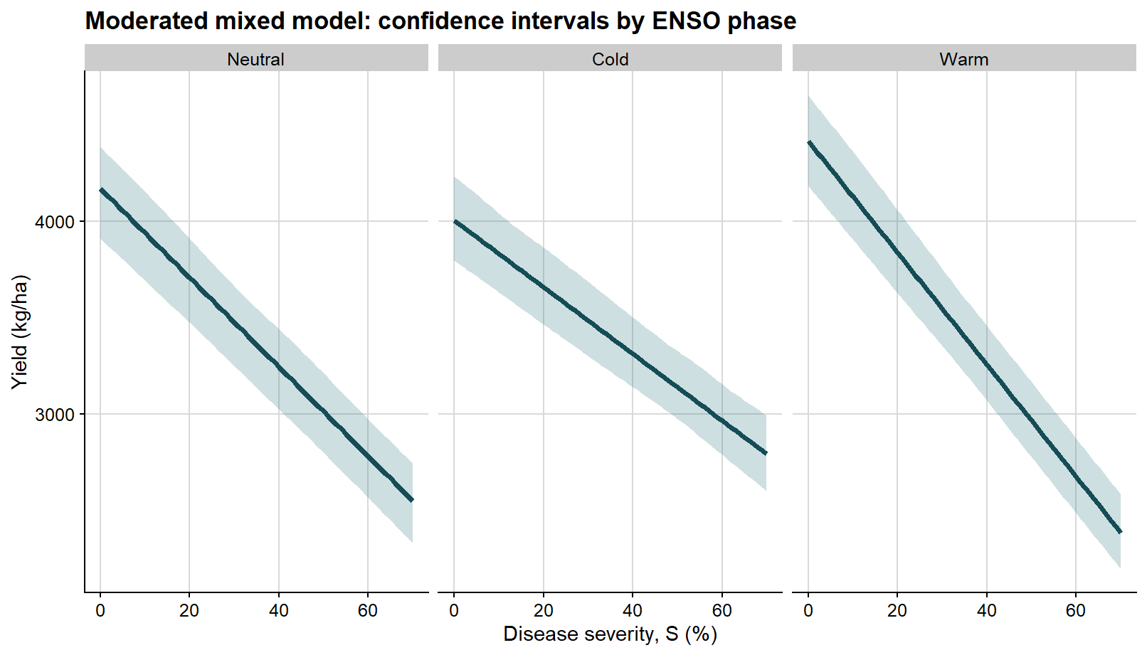
ggplot(enso_curves, aes(severity, fit)) +# confidence interval for the mean fitted response in each phasegeom_ribbon(aes(ymin = conf_lb, ymax = conf_ub), fill ="#1f6f78", alpha =0.22) +geom_line(color ="#154d57", linewidth =1.3) +facet_wrap(~enso, nrow =1) +background_grid() +labs(title ="Moderated mixed model: confidence intervals by ENSO phase",x ="Disease severity, S (%)",y ="Yield (kg/ha)" )
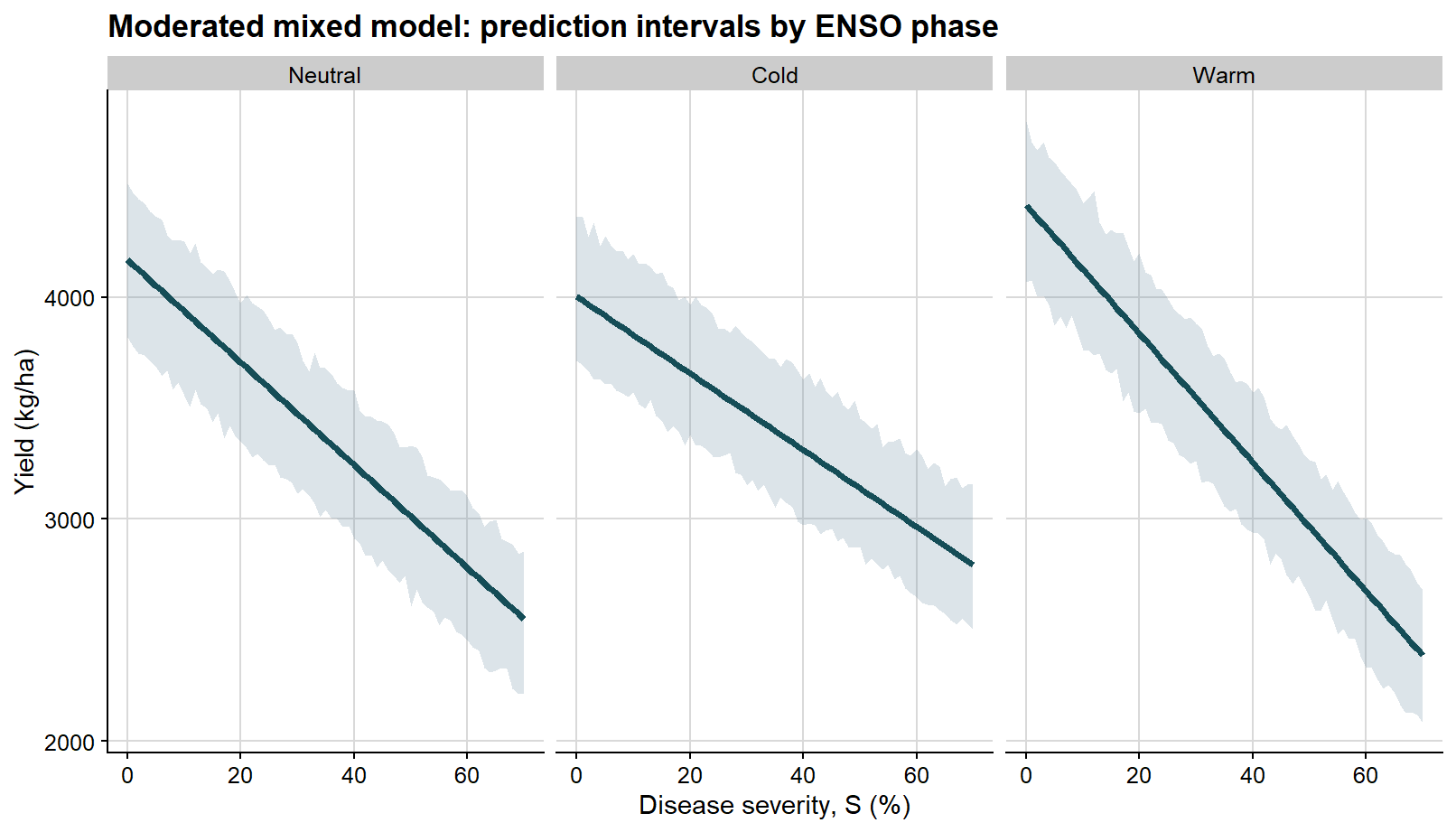
The second faceted figure shows the prediction interval, which is wider because it reflects the variability of future observations around those phase-specific mean lines.
Again, because these prediction bands are constructed from finite bootstrap percentiles, they may display slight local waviness instead of perfectly straight boundaries. With a relatively small number of bootstrap simulations, that behavior should be interpreted as a numerical feature of the resampling procedure rather than as evidence that the underlying mean relationship is nonlinear.
ggplot(enso_curves, aes(severity, fit)) +# prediction interval for a new observation in each phasegeom_ribbon(aes(ymin = pred_lb, ymax = pred_ub), fill ="#6e8fa4", alpha =0.24) +geom_line(color ="#154d57", linewidth =1.3) +facet_wrap(~enso, nrow =1) +background_grid() +labs(title ="Moderated mixed model: prediction intervals by ENSO phase",x ="Disease severity, S (%)",y ="Yield (kg/ha)" )
Once the distinction is clear, the two types of interval can be merged in a single view.
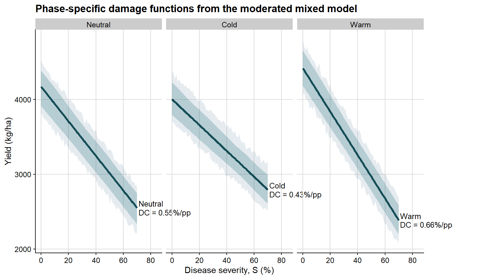
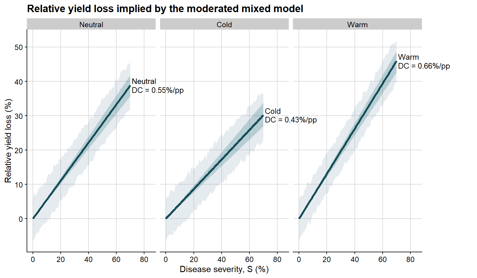
Because disease damage is often easier to interpret on a relative scale, it is also useful to express the same bootstrap results in terms of percentage yield loss.
The next plot follows the same logic, but the y-axis is now expressed as relative yield loss rather than absolute yield.
ggplot(enso_curves, aes(severity, rel_loss_fit)) +# prediction interval on the relative-loss scalegeom_ribbon(aes(ymin = rel_loss_pred_lb, ymax = rel_loss_pred_ub), fill ="#6e8fa4", alpha =0.18) +# confidence interval on the relative-loss scalegeom_ribbon(aes(ymin = rel_loss_conf_lb, ymax = rel_loss_conf_ub), fill ="#1f6f78", alpha =0.24) +geom_line(color ="#154d57", linewidth =1.35) +geom_text(data = phase_label_df,aes(x =71, y = rel_loss_fit, label = label),hjust =0,vjust =0.5,size =3.4,lineheight =0.95 ) +facet_wrap(~enso, nrow =1) +coord_cartesian(xlim =c(0, 84), clip ="off") +background_grid() +labs(title ="Relative yield loss implied by the moderated mixed model",x ="Disease severity, S (%)",y ="Relative yield loss (%)" ) +theme(plot.margin =margin(5.5, 70, 5.5, 5.5))
This step preserves interpretation at the mixed-model level. We are still working with the fixed effects from a mixed-effects model fitted with lmer(), but now expressing them in the classical language of attainable yield, slope, and damage coefficient.
The mixed-effects workflow keeps the raw observations in a single model. That is often the most natural route when the analyst has access to the complete dataset. Sometimes, however, the scientific question is framed differently: each study contributes its own damage estimate, and the synthesis happens at the study level. That is the logic of the next workflow.
A separate route: study-level regressions followed by meta-analysis
The inferential logic of meta-analysis is distinct from that of mixed models and is therefore best presented as a separate workflow. The important shift is that the study, not the individual observation, becomes the main unit of synthesis.
With mixed-effects modeling, we model the raw data directly.
With meta-analysis, the workflow proceeds by fitting a series of regressions, one for each study, and only then synthesizing the resulting study-level damage estimates. In this workflow, the study-specific damage coefficient is obtained through two regression steps, following the logic commonly used in classical yield loss analyses. The earlier selection step matters especially here because weak study-level gradients can produce unstable slopes and misleading sampling variances.
So the sequence is:
fit an ordinary regression for each study
extract intercept and slope
compute the study-specific damage coefficient
estimate its sampling variance
meta-analyze those study-level estimates
Step 1. First regression: yield on severity within each study
The first regression provides the study-specific intercept and slope. The intercept is carried forward as the study-specific estimate of attainable yield, so this step is not just a preliminary calculation; it defines the scale on which relative loss will be computed.
# One row per selected study; each nested dataset is analyzed separately.study_regression_1 <- damage_df %>%nest(data =-c(study, year, enso)) %>%mutate(# First regression: absolute yield as a function of severity.fit_yield = purrr::map(data, ~lm(yield ~ severity, data = .x)),# The intercept is carried forward as study-specific attainable yield.intercept = purrr::map_dbl(fit_yield, ~coef(.x)[1]),slope_yield = purrr::map_dbl(fit_yield, ~coef(.x)[2]) )# Show the first-step coefficients before transforming the response.study_regression_1 %>% dplyr::select(study, year, enso, intercept, slope_yield) %>%slice_head(n =8) %>%mutate(intercept =round(intercept, 2),slope_yield =round(slope_yield, 2) ) %>%kable(caption ="Study-specific coefficients from the first regression")
Study-specific coefficients from the first regression
study
year
enso
intercept
slope_yield
1
2013
Neutral
4482.26
-24.37
2
2013
Cold
4189.33
-21.67
3
2013
Warm
4440.60
-32.61
4
2014
Neutral
3893.56
-20.64
5
2014
Cold
4333.12
-15.47
6
2014
Warm
4325.53
-29.08
7
2015
Neutral
4323.19
-26.14
8
2015
Cold
4104.14
-22.33
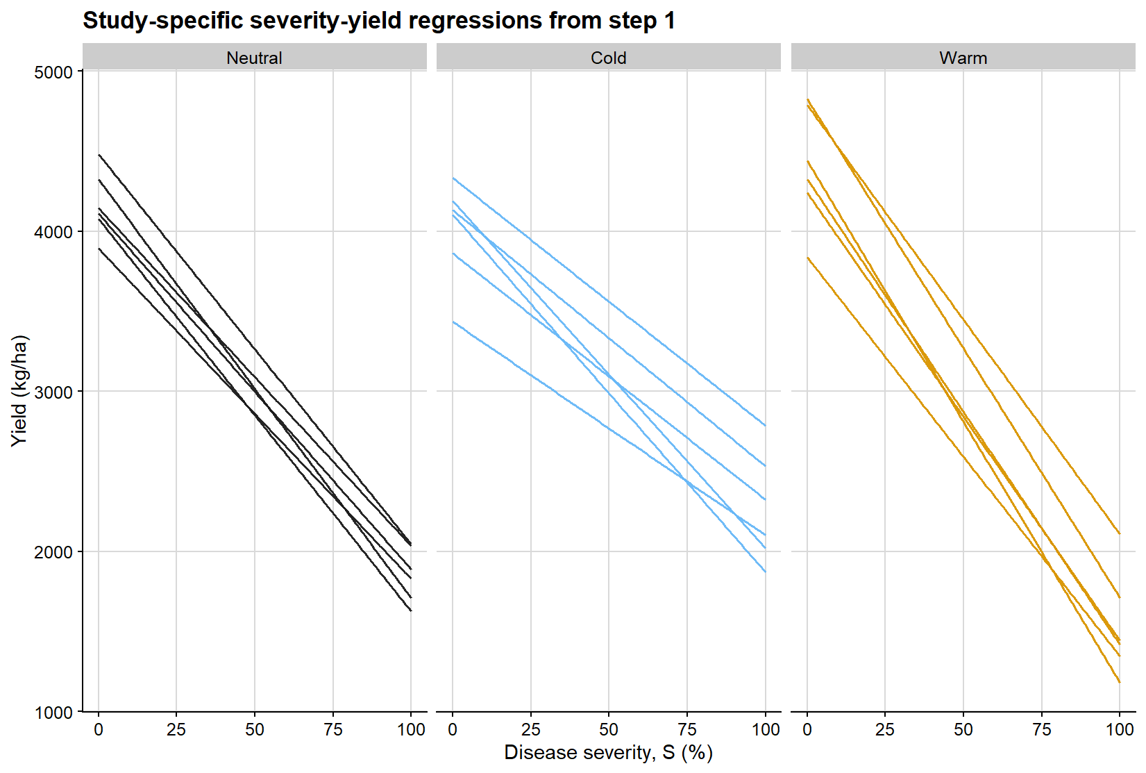
Before moving to the relative-loss scale, it is helpful to visualize what the first regression is doing. Each line below represents the fitted severity-yield relationship for a single study, stratified by ENSO phase. This makes explicit that the first step of the meta-analytic workflow is not a single pooled regression, but rather a collection of study-specific linear damage functions from which intercepts and slopes are extracted.
# Create fitted lines from the first regression for visualization.study_line_grid <-expand_grid( study_regression_1 %>% dplyr::select(study, enso, intercept, slope_yield),severity =seq(0, 100, by =1)) %>%mutate(fitted_yield = intercept + slope_yield * severity,enso =factor(enso, levels =c("Neutral", "Cold", "Warm")) )
ggplot(study_line_grid, aes(severity, fitted_yield, group = study, color = enso)) +geom_line(linewidth =0.55, alpha =0.95, show.legend =FALSE) +facet_wrap(~enso, nrow =1) +scale_color_manual(values = enso_palette) +background_grid() +labs(title ="Study-specific severity-yield regressions from step 1",x ="Disease severity, S (%)",y ="Yield (kg/ha)" )
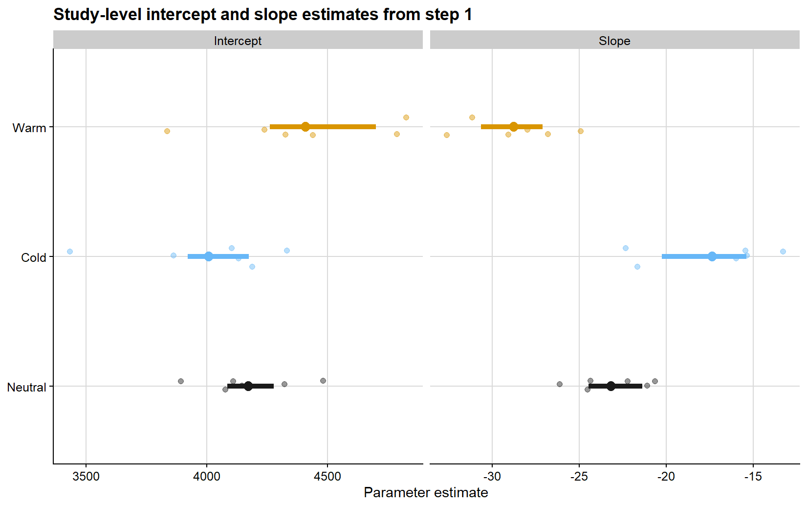
The next figure summarizes the study-specific coefficients extracted from those first-step regressions. The point clouds represent the individual study estimates, while the larger points and horizontal segments show the phase-specific means and central ranges. This display is useful because it separates variation in attainable yield from variation in absolute damage rate before the transformation to relative loss is introduced.
# Put intercepts and slopes into one table for a compact coefficient plot.study_parameter_plot_df <-bind_rows( study_regression_1 %>%transmute(enso =factor(enso, levels =c("Neutral", "Cold", "Warm")),parameter ="Intercept",estimate = intercept ), study_regression_1 %>%transmute(enso =factor(enso, levels =c("Neutral", "Cold", "Warm")),parameter ="Slope",estimate = slope_yield ))# Summarize each phase so individual estimates can be compared with group patterns.study_parameter_summary <- study_parameter_plot_df %>%group_by(parameter, enso) %>%summarise(mean_estimate =mean(estimate),q25 =quantile(estimate, 0.25),q75 =quantile(estimate, 0.75),.groups ="drop" )
ggplot(study_parameter_plot_df, aes(x = estimate, y = enso, color = enso)) +geom_point(position =position_jitter(height =0.08, width =0),alpha =0.45,size =1.7,show.legend =FALSE ) +geom_segment(data = study_parameter_summary,aes(x = q25, xend = q75, y = enso, yend = enso, color = enso),linewidth =1.8,inherit.aes =FALSE,show.legend =FALSE ) +geom_point(data = study_parameter_summary,aes(x = mean_estimate, y = enso, color = enso),size =3.2,inherit.aes =FALSE,show.legend =FALSE ) +facet_wrap(~parameter, scales ="free_x") +scale_color_manual(values = enso_palette) +background_grid() +labs(title ="Study-level intercept and slope estimates from step 1",x ="Parameter estimate",y =NULL )
Step 2. Relative yield loss based on the study-specific intercept
Following the classical logic, yield loss is now expressed relative to the attainable yield of each study. For each observation:
\[L = 100 \times \frac{b_0 - Y}{b_0}\]
where \(L\) is relative yield loss in percent and \(b_0\) is the study-specific attainable yield obtained from the first regression.
# Join the study-specific attainable yield back to every observation.relative_loss_df <- damage_df %>%left_join( study_regression_1 %>% dplyr::select(study, year, enso, intercept),by =c("study", "year", "enso") ) %>%mutate(# Step 2 transformation: absolute yield becomes relative yield loss.relative_loss =100* (intercept - yield) / intercept )# Inspect the transformed response before fitting second-step regressions.relative_loss_df %>% dplyr::select(study, enso, severity, yield, intercept, relative_loss) %>%slice_head(n =8) %>%mutate(across(c(severity, yield, intercept, relative_loss), ~round(.x, 2)) ) %>%kable(caption ="Relative yield loss calculated from the study-specific attainable yield")
Relative yield loss calculated from the study-specific attainable yield
study
enso
severity
yield
intercept
relative_loss
1
Neutral
2.08
4286.70
4482.26
4.36
1
Neutral
2.28
4635.06
4482.26
-3.41
1
Neutral
6.28
4345.97
4482.26
3.04
1
Neutral
10.18
4221.84
4482.26
5.81
1
Neutral
22.07
3819.73
4482.26
14.78
1
Neutral
23.27
3949.15
4482.26
11.89
1
Neutral
23.76
3833.61
4482.26
14.47
1
Neutral
27.05
3784.80
4482.26
15.56
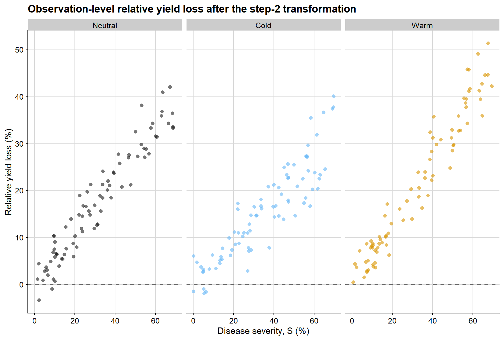
At this stage, the response variable has changed. The figure below shows the observation-level relative yield loss obtained after scaling each yield value by the study-specific attainable yield from the first regression. This step is critical because it moves the analysis from the absolute scale of yield to the proportional scale on which the damage coefficient is defined. It also means that uncertainty in the first-regression intercept can influence the second-stage effect size.
ggplot(relative_loss_df, aes(severity, relative_loss, color = enso)) +geom_hline(yintercept =0, linetype =2, color ="grey40", linewidth =0.7) +geom_point(shape =16, alpha =0.6, size =1.8, show.legend =FALSE) +facet_wrap(~enso, nrow =1) +scale_color_manual(values = enso_palette) +background_grid() +labs(title ="Observation-level relative yield loss after the step-2 transformation",x ="Disease severity, S (%)",y ="Relative yield loss (%)" )
Step 3. Second regression: relative loss on severity through the origin
We then fit a second regression for each study:
\[L = DC \times S\]
That is, relative yield loss is regressed on severity with no intercept, and the slope of this second regression is the study-specific damage coefficient. The through-origin constraint encodes the assumption that zero disease corresponds to zero relative disease loss after scaling by attainable yield. This is reasonable for the didactic example, but in empirical work it should be checked against the design, disease range, and presence of other yield-limiting factors.
# Fit the second regression separately for each study.study_effects <- relative_loss_df %>%nest(data =-c(study, year, enso, intercept)) %>%mutate(# No intercept: zero disease is assumed to imply zero disease-attributable loss.fit_dc = purrr::map(data, ~lm(relative_loss ~0+ severity, data = .x)),# The slope is the study-level damage coefficient.damage_coefficient = purrr::map_dbl(fit_dc, ~coef(.x)[1]),# Sampling variance is needed for inverse-variance weighting in meta-analysis.vi_dc = purrr::map_dbl(fit_dc, ~vcov(.x)[1, 1]),sei_dc =sqrt(vi_dc) ) %>%ungroup()study_effects %>% dplyr::select(study, year, enso, damage_coefficient, sei_dc) %>%slice_head(n =8) %>%mutate(damage_coefficient =round(damage_coefficient, 3),sei_dc =round(sei_dc, 4) ) %>%kable(caption ="Study-level damage coefficients from the second regression")
Study-level damage coefficients from the second regression
study
year
enso
damage_coefficient
sei_dc
1
2013
Neutral
0.544
0.0192
2
2013
Cold
0.517
0.0214
3
2013
Warm
0.734
0.0248
4
2014
Neutral
0.530
0.0179
5
2014
Cold
0.357
0.0200
6
2014
Warm
0.672
0.0244
7
2015
Neutral
0.605
0.0249
8
2015
Cold
0.544
0.0129
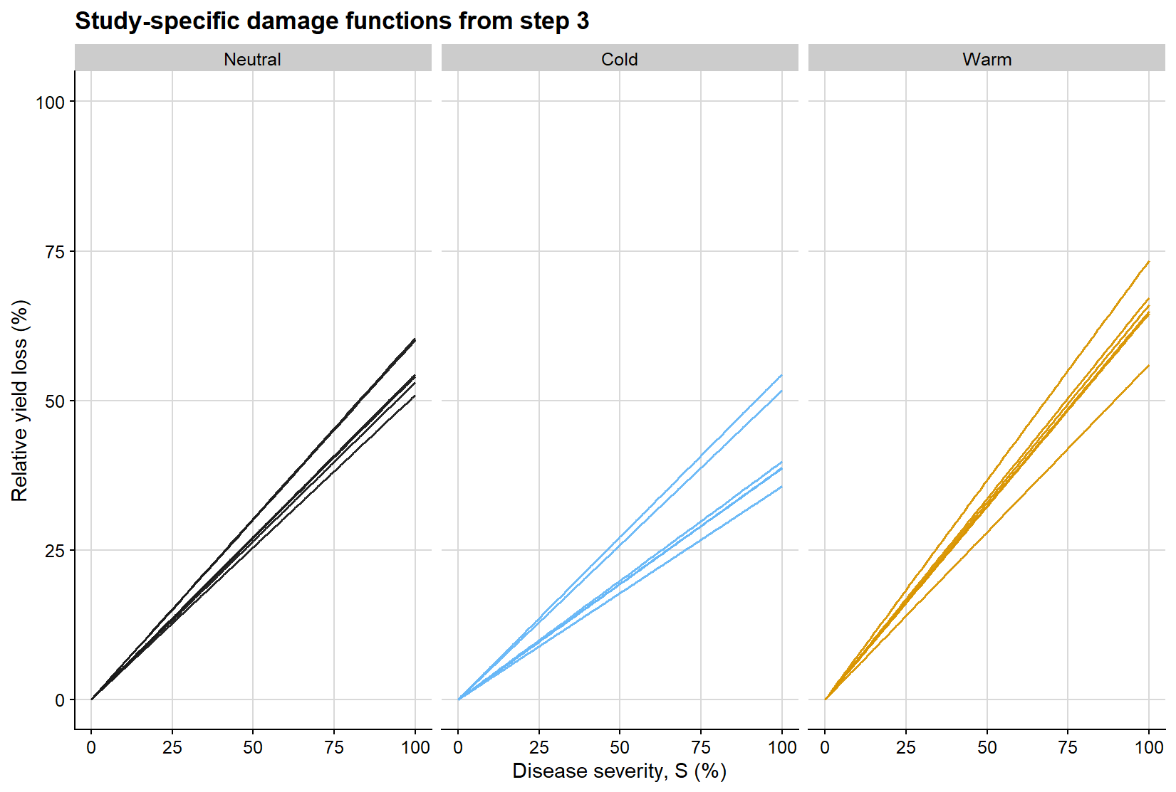
The second regression is easier to interpret visually when represented as a family of lines constrained to pass through the origin. Each line below is a study-specific estimate of the damage coefficient, obtained from regressing relative yield loss on severity without an intercept. The slope of each line is therefore the study-level damage coefficient used in the subsequent meta-analysis.
ggplot(dc_line_grid, aes(severity, relative_loss, group = study, color = enso)) +geom_line(linewidth =0.55, alpha =0.95, show.legend =FALSE) +facet_wrap(~enso, nrow =1) +scale_color_manual(values = enso_palette) +coord_cartesian(xlim =c(0, 100), ylim =c(0, 100)) +background_grid() +labs(title ="Study-specific damage functions from step 3",x ="Disease severity, S (%)",y ="Relative yield loss (%)" )
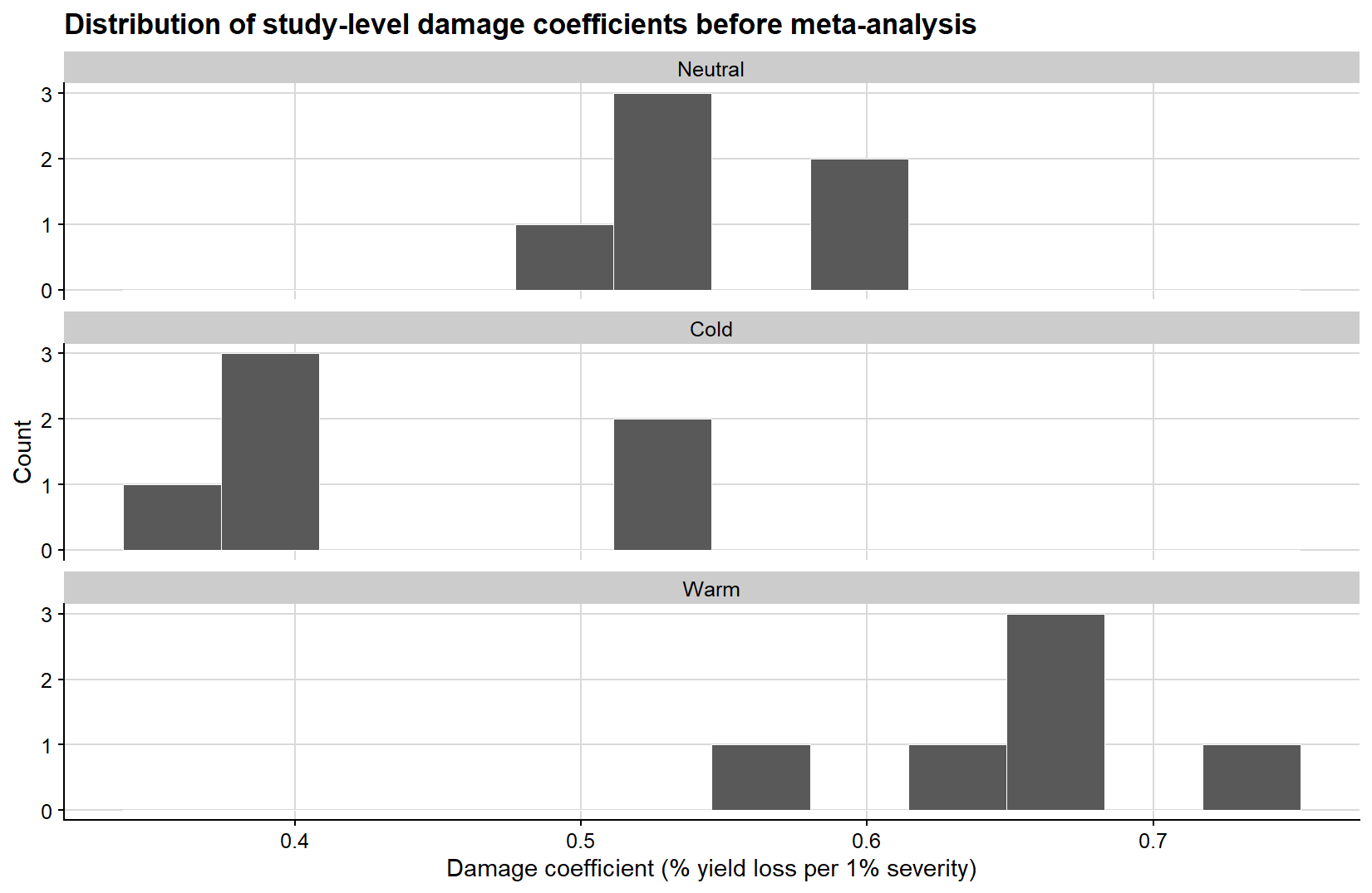
Because the second-step slopes are the quantities ultimately synthesized in the meta-analysis, it is also useful to examine their empirical distribution before fitting the meta-analytic model. The histogram below gives a direct view of how the study-level damage coefficients are distributed within each ENSO phase.
ggplot(study_effects, aes(damage_coefficient)) +geom_histogram(bins =12, fill ="grey35", color ="white", linewidth =0.2) +facet_wrap(~enso, ncol =1, scales ="free_y") +background_grid() +labs(title ="Distribution of study-level damage coefficients before meta-analysis",x ="Damage coefficient (% yield loss per 1% severity)",y ="Count" )
The variance calculation is critical. A meta-analytic model does not only require the effect size estimate (yi); it also requires the corresponding sampling variance (vi) or standard error. Without that information, studies cannot be weighted appropriately. The simple variance used here comes from the second regression and keeps the example transparent; a publication-level analysis may need a delta-method, bootstrap, or joint-model strategy to propagate uncertainty from both regression steps.
Fitting the meta-analytic model
The study-specific damage coefficients can now be synthesized with a multilevel meta-analytic model. Because studies are clustered within years, I use rma.mv() instead of rma.uni(). This preserves the study-level effect-size logic while recognizing that estimates from the same year may share environmental, management, or assessment conditions.
At this point the data have changed shape. We are no longer modeling each yield observation directly. We are modeling the collection of study-level damage coefficients and their sampling variances.
A meta-analytic estimate without moderators
The first meta-analytic step mirrors the general mixed-effects summary: a single pooled damage coefficient across all studies, without moderators.
# Overall synthesis of study-level damage coefficients.meta_damage_overall <-rma.mv(# yi is the study-level effect size; V is its sampling variance.yi = damage_coefficient,V = vi_dc,mods =~1,# Studies are nested within years in this simulated example.random =~1| year/study,method ="REML",data = study_effects)meta_damage_overall
Multivariate Meta-Analysis Model (k = 18; method: REML)

Variance Components:

            estim    sqrt  nlvls  fixed      factor
sigma^2.1  0.0000  0.0000      6     no        year
sigma^2.2  0.0113  0.1065     18     no  year/study

Test for Heterogeneity:
Q(df = 17) = 472.1951, p-val < .0001

Model Results:

estimate      se     zval    pval   ci.lb   ci.ub
  0.5466  0.0256  21.3612  <.0001  0.4965  0.5968  ***

---
Signif. codes:  0 '***' 0.001 '**' 0.01 '*' 0.05 '.' 0.1 ' ' 1
This model answers a simple question: if ENSO is ignored and all study-level damage coefficients are pooled together, what is the average damage coefficient implied by the meta-analytic structure?
# Extract the pooled estimate and uncertainty from the overall meta-analysis.meta_overall_summary <-tibble(method ="Meta-analysis",estimate =coef(summary(meta_damage_overall))[1, "estimate"],se =coef(summary(meta_damage_overall))[1, "se"],ci_lb =coef(summary(meta_damage_overall))[1, "ci.lb"],ci_ub =coef(summary(meta_damage_overall))[1, "ci.ub"])meta_overall_summary %>%mutate(across(c(estimate, se, ci_lb, ci_ub), ~round(.x, 3))) %>%kable(caption ="Overall meta-analytic damage coefficient without moderators")
Overall meta-analytic damage coefficient without moderators
method
estimate
se
ci_lb
ci_ub
Meta-analysis
0.547
0.026
0.496
0.597
A meta-analytic estimate with ENSO as moderator
The second meta-analytic model introduces ENSO as a moderator, so that pooled damage coefficients are estimated separately for each phase.
# Moderator model: estimate one pooled damage coefficient per ENSO phase.meta_damage <-rma.mv(# The effect size and variance are the same as above.yi = damage_coefficient,V = vi_dc,# Removing the intercept gives one coefficient for each ENSO phase.mods =~0+ enso,random =~1| year/study,method ="REML",data = study_effects)meta_damage
Multivariate Meta-Analysis Model (k = 18; method: REML)

Variance Components:

            estim    sqrt  nlvls  fixed      factor
sigma^2.1  0.0000  0.0000      6     no        year
sigma^2.2  0.0033  0.0573     18     no  year/study

Test for Residual Heterogeneity:
QE(df = 15) = 161.7665, p-val < .0001

Test of Moderators (coefficients 1:3):
QM(df = 3) = 1481.4279, p-val < .0001

Model Results:

             estimate      se     zval    pval   ci.lb   ci.ub
ensoNeutral    0.5547  0.0250  22.2185  <.0001  0.5057  0.6036  ***
ensoCold       0.4335  0.0248  17.4659  <.0001  0.3848  0.4821  ***
ensoWarm       0.6522  0.0250  26.1287  <.0001  0.6033  0.7011  ***

---
Signif. codes:  0 '***' 0.001 '**' 0.01 '*' 0.05 '.' 0.1 ' ' 1
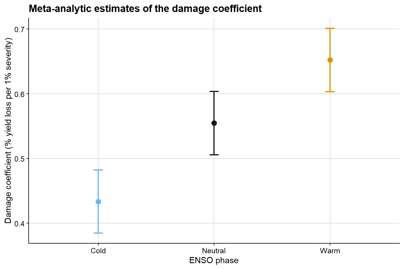
This model estimates a pooled damage coefficient for each ENSO phase while accounting for residual heterogeneity and clustering among studies within years.
Extracting pooled estimates
# Convert the metafor coefficient table into a tidy summary.meta_summary <-tibble(enso =gsub("^enso", "", rownames(coef(summary(meta_damage)))),estimate =coef(summary(meta_damage))[,"estimate"],se =coef(summary(meta_damage))[,"se"],ci_lb =coef(summary(meta_damage))[,"ci.lb"],ci_ub =coef(summary(meta_damage))[,"ci.ub"])meta_summary %>%mutate(estimate =round(estimate, 3),se =round(se, 3),ci_lb =round(ci_lb, 3),ci_ub =round(ci_ub, 3) ) %>%kable(caption ="Meta-analytic damage coefficient estimates by ENSO phase")
Meta-analytic damage coefficient estimates by ENSO phase
enso
estimate
se
ci_lb
ci_ub
Neutral
0.555
0.025
0.506
0.604
Cold
0.433
0.025
0.385
0.482
Warm
0.652
0.025
0.603
0.701
The next figure summarizes the pooled damage coefficient estimates and their uncertainty at the meta-analytic level for the ENSO-specific model.
ggplot(meta_summary, aes(x = enso, y = estimate, color = enso)) +geom_point(size =3) +geom_errorbar(aes(ymin = ci_lb, ymax = ci_ub), width =0.08, linewidth =0.8) +scale_color_manual(values = enso_palette) +background_grid() +labs(title ="Meta-analytic estimates of the damage coefficient",x ="ENSO phase",y ="Damage coefficient (% yield loss per 1% severity)",color ="ENSO phase" ) +theme(legend.position ="none")
Comparing mixed-effects and meta-analytic estimates
At this point, it becomes possible to compare the two strategies directly. This comparison is informative because the two methods do not operate on the same inferential target:
mixed-effects modeling summarizes the full hierarchical dataset at the observation level
meta-analysis summarizes study-level damage coefficients after the two-regression workflow
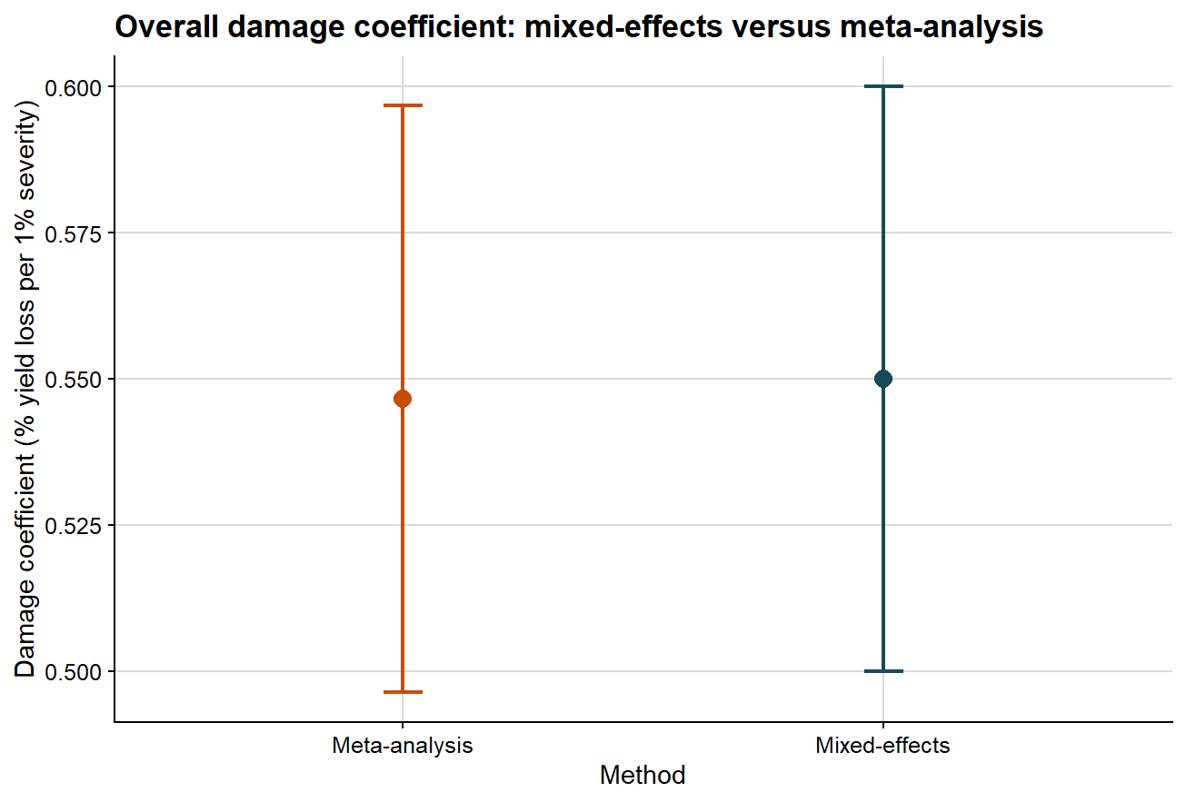
Comparing the overall damage coefficient
The first comparison ignores moderators and asks whether both methods support a similar overall interpretation of disease damage.
# Keep only the damage coefficient from the mixed-model summary.lmer_overall_compare <- overall_damage %>%filter(term =="Damage coefficient") %>%transmute(method ="Mixed-effects", estimate, ci_lb, ci_ub )# Put the two methods on the same scale for comparison.overall_compare <-bind_rows( lmer_overall_compare, meta_overall_summary %>%transmute(method ="Meta-analysis", estimate, ci_lb, ci_ub ))overall_compare %>%mutate(across(c(estimate, ci_lb, ci_ub), ~round(.x, 3))) %>%kable(caption ="Comparison of the overall damage coefficient from mixed-effects and meta-analytic models")
Comparison of the overall damage coefficient from mixed-effects and meta-analytic models
method
estimate
ci_lb
ci_ub
Mixed-effects
0.550
0.500
0.600
Meta-analysis
0.547
0.496
0.597
The next plot presents that comparison graphically.
ggplot(overall_compare, aes(x = method, y = estimate, color = method)) +# point estimate from each methodgeom_point(size =3.2) +# uncertainty interval from each methodgeom_errorbar(aes(ymin = ci_lb, ymax = ci_ub), width =0.08, linewidth =0.8) +scale_color_manual(values =c("Mixed-effects"="#154d57", "Meta-analysis"="#c84c09")) +background_grid() +labs(title ="Overall damage coefficient: mixed-effects versus meta-analysis",x ="Method",y ="Damage coefficient (% yield loss per 1% severity)" ) +theme(legend.position ="none")
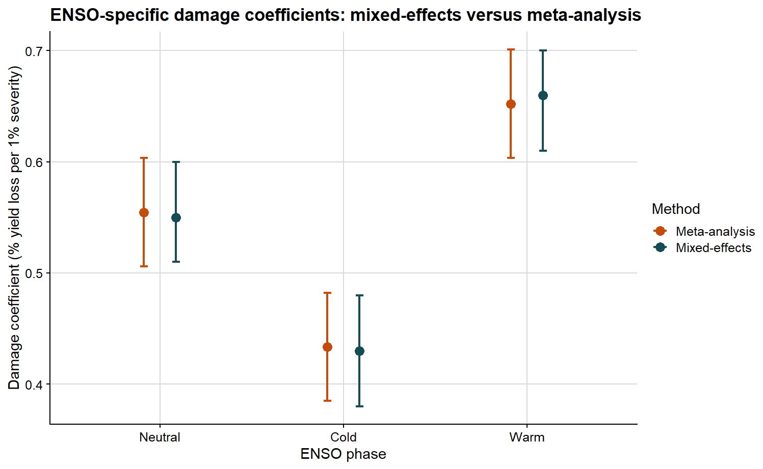
Comparing the ENSO-specific damage coefficients
The second comparison preserves the ENSO structure and asks whether the phase-specific pattern is consistent across methods.
# Extract ENSO-specific damage coefficients from the mixed-model route.lmer_phase_compare <- lmer_phase_estimates %>%filter(parameter =="Damage coefficient") %>%transmute( enso,method ="Mixed-effects", estimate, ci_lb, ci_ub )# Put ENSO-specific mixed-model and meta-analytic estimates together.meta_phase_compare <- meta_summary %>%transmute(enso =factor(enso, levels =c("Neutral", "Cold", "Warm")),method ="Meta-analysis", estimate, ci_lb, ci_ub )phase_compare <-bind_rows(lmer_phase_compare, meta_phase_compare)phase_compare %>%mutate(across(c(estimate, ci_lb, ci_ub), ~round(.x, 3))) %>%kable(caption ="ENSO-specific damage coefficient estimates from mixed-effects and meta-analytic models")
ENSO-specific damage coefficient estimates from mixed-effects and meta-analytic models
enso
method
estimate
ci_lb
ci_ub
Neutral
Mixed-effects
0.550
0.510
0.600
Cold
Mixed-effects
0.430
0.380
0.480
Warm
Mixed-effects
0.660
0.610
0.700
Neutral
Meta-analysis
0.555
0.506
0.604
Cold
Meta-analysis
0.433
0.385
0.482
Warm
Meta-analysis
0.652
0.603
0.701
The plot below allows the ENSO-specific DC values to be compared side by side.
ggplot(phase_compare, aes(x = enso, y = estimate, color = method)) +# position dodge separates the two methods inside each ENSO phasegeom_point(position =position_dodge(width =0.35), size =3) +geom_errorbar(aes(ymin = ci_lb, ymax = ci_ub),position =position_dodge(width =0.35),width =0.08,linewidth =0.8 ) +scale_color_manual(values =c("Mixed-effects"="#154d57", "Meta-analysis"="#c84c09")) +background_grid() +labs(title ="ENSO-specific damage coefficients: mixed-effects versus meta-analysis",x ="ENSO phase",y ="Damage coefficient (% yield loss per 1% severity)",color ="Method" )
If both approaches support a similar biological interpretation, we should observe broad agreement in the ordering and magnitude of the damage coefficients. If they differ, that discrepancy is itself informative, because the methods summarize different statistical objects and use different weighting logic.
Under this type of model, interpretation is relatively straightforward:
larger values indicate greater proportional yield loss per unit increase in disease
differences among phases suggest that the severity-yield relationship changes with context
residual heterogeneity indicates that the damage process is not fully explained by the moderator alone
Mixed-effects modeling or meta-analysis?
These approaches answer related but distinct questions.
Use mixed-effects modeling when:
you want to model the full hierarchical dataset directly
you need study-level random intercepts and random slopes
you want to test fixed effects and interactions at the observation level
Use meta-analysis when:
your primary unit of inference is the study-level effect size
you want to synthesize slopes or damage coefficients across many studies
you need a formal meta-analytic framework for moderators and heterogeneity
In applied work, both approaches can be part of the same analytical workflow rather than viewed as competitors. A mixed model helps describe the raw hierarchical structure of the data, whereas a meta-analysis summarizes and compares study-level damage processes. The comparison above is useful precisely because it shows where the two perspectives converge and where they diverge.
For a reader trying to reproduce the workflow, the practical lesson is simple: choose the method after deciding what the unit of inference should be. If the question is about the full hierarchical dataset, start with the mixed model. If the question is about synthesizing study-specific damage estimates, build the study-level effect sizes carefully and then use meta-analysis.
Final remarks
Yield loss modeling in plant pathology involves considerably more than fitting a regression line between severity and yield. It requires deciding which disease metric is meaningful, which studies are informative, which yield baseline is defensible, and which inferential target the analysis is trying to estimate. The central parameters each address a different scientific question:
attainable yield asks what the crop could produce in the absence of disease under the studied conditions
slope asks how quickly yield declines as disease increases
damage coefficient asks how large that decline is in relative terms
From that point onward, model choice depends on the inferential objective. If the interest lies in the full hierarchical dataset, mixed-effects modeling is often the natural starting point. If the objective is the synthesis of study-specific damage estimates, a meta-analytic framework becomes essential.
The study-selection step belongs in the same inferential workflow as the models. It protects the analysis from studies that lack disease contrast, never reach meaningful disease pressure, or imply implausible attainable yields. Just as importantly, it forces the analyst to state the empirical domain over which the damage coefficient is being estimated.
For plant disease epidemiology, that domain matters. A damage coefficient is interpretable only in relation to the pathosystem, disease metric, assessment timing, production environment, and yield potential represented in the data. Mixed-effects models and meta-analysis provide complementary ways to summarize that evidence, but neither removes the need to inspect whether the included studies are biologically and statistically informative.
Finally, the numerical estimates in this article should be interpreted only as outputs from a simulated teaching example. They are useful for understanding the workflow, but they are not evidence for the magnitude of disease damage in any real production system. Readers interested in empirical conclusions about soybean rust damage under climate variability should refer to the original study and its accompanying analysis page.
Subscribe
Enjoy this blog? Get notified of new posts by email: